Google's Inconsistent Share Button
January 7, 2016 | 2 min read
Google’s Material Design promises not only to bring consistency across products, but also to bring consistency within Google’s design language itself.
In the Material Design documentation, there are best practices for system icons:
Consistency aids user comprehension of icons. Use the existing system icons whenever possible and across different applications.
Which is all well and good. That’s what system icons should do. They should be consistent and clear. But as we start 2016, not everyone within Google has gotten the message yet.
The Canonical Share Icon
This is Google’s sanctioned share icon.

The icon is three nodes with lines connecting each of them. There isn’t any universal icon for sharing, but this one is reasonably clear.
And most Google properties use the right one.
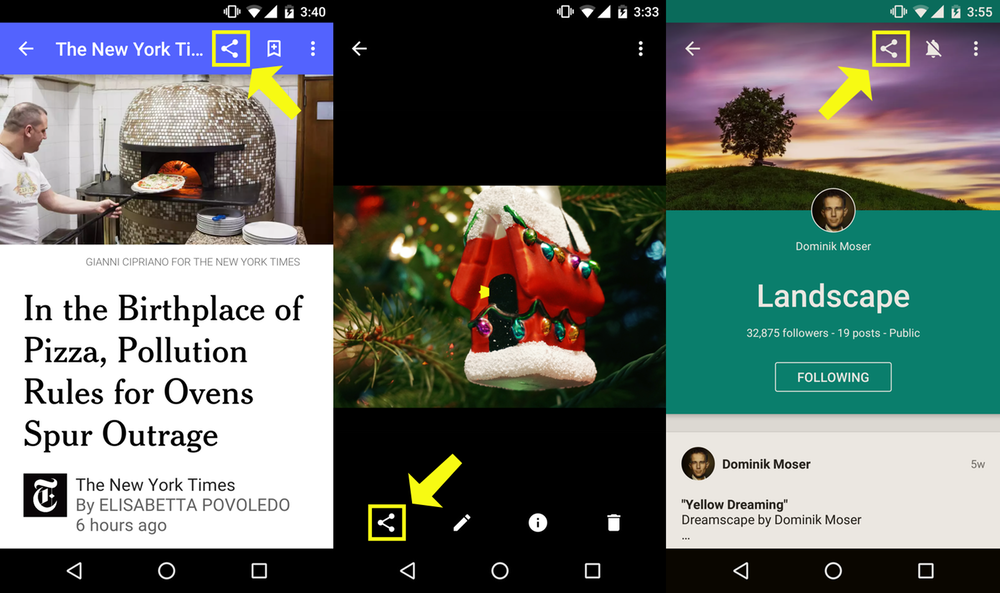 The correct share icon in Google Play Newsstand, Google Photos, and Google Plus.
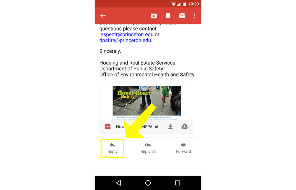
The Reply Icon
This is Google’s reply icon.

Here is the reply icon in Gmail.
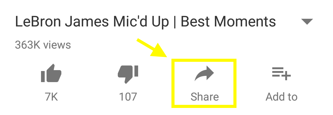
The Wrong Share Icon (the mirrored reply)
But the Android YouTube app uses this.1

Here it is in action.
 It’s also next to the like/dislike buttons below the video (h/t Gazalan on Reddit).
This icon is worse than being obscure. It’s confusing because it’s almost identical to the reply icon.
A bad icon points in the general direction of its functionality. A terrible icon boldly points in the wrong way.
UPDATE: It is now 2017, and Youtube still uses the reverse reply icon as its non-conforming share button. The Youtube app on Android just updated a couple of days ago, and now it even has the text “Share” below the icon. 😕
-
Google Trends also falls victim to the non-standard share icon. YouTube on the web does as well (it’s under the subscribe button). ↩